Wednesday, August 22, 2012

Website Mascot Design

I was recently commissioned to design a character to be the mascot for a website business. The idea was to use the character to visually represent five different pages on the site: Contact/How to Find Us, Security/Log In, What to Bring, Greeting/Intro, and Sign Up.

We began developing the character with several different sketches, narrowing it down to three options, and then chose one to use for the final illustrations. The goal for the mascot was to have him be something of a nerd (but cool at the same time), 20-something years old, and dressed casually. Some initial sketches below:


Two of the contestants who moved on to the 2nd round:


The final illustrations:


Bonus! A bit of the process below as a nifty animated GIF. :)


Thursday, August 16, 2012

Funny Phobias Animation

Ahem!

I would formally like to present to you my first stab at traditional animation!

It's running only at 15 fps - largely because the project was a fairly quick turnaround from initial sketches to final product (about 2 weeks). So for those of you keeping score at home, that's roughly around 1,000 drawings if you minus out the time text is on the screen.

Thanks again to the guys over at the creative department at Elevation!

Enjoy!


Funny Phobias from Elevation Church on Vimeo.

Wednesday, August 8, 2012

Graysen Green Dress

Earlier this year, I was approached by a couple named Frank and Jessica Bealer to work on their children's book "Graysen Green Dress Tries a Pink Dress" - a cute father-daughter story with a heartfelt military family slant. So for the months of May, June, and July, we worked together to hammer out the layout process and illustrations for the book, and released it July 31st!

Currently, the book is available only for the iPad and Kindle, but we're hoping to have a physical copy published sometime in the future! Below are some images from the making of the book as well as a few of the finished illustrations you'll see in the final.

An early version of the storyboard laid out.

Rough sketches to flesh out the storyboards further.

Graysen's green pajamas.

Finished drawing for the illustration below.

Shopping for the pink dress.

Graysen and her father.

I'd like to thank the Bealers for the opportunity to work on such a great story, and also to everyone else for supporting those of us who tell stories!

Again, the book is currently available in digital format on Amazon!

Friday, July 13, 2012

Vikings Love Their Mothers, Too


A little work-in-progress fun.

A Leaping Fox How-To...

Here's a little fox illustration that I created using largely pencils, Photoshop, and my Wacom tablet. Hope you find it useful!


I started off with just a sketch from reference, adding a little extra here and there. I've been using my (magic!) blue Col-erase pencils a ton lately, adding in some darker pencils on top afterwards to push the depth.


I scanned the drawing and brought it into Photoshop, where I put it in a multiply layer and lowered the opacity waaay down (to something like 18%). It may seem like I'm wasting a lot of work I did with the shading and lines, but it comes through in the end. 

On a new layer beneath it, I laid down that hot orange-red, and added a couple shades of color lighter and darker to keep it from being flat and give a general idea of the form. 


From there, on a third layer, I added some black to the ears, snout and front paws. No need to worry about staying inside the lines up to this point. (Read: You can color like a 3 year old - it'll be fun. Trust me.)


Satisfied with those layers, I created vector masks for each and defined where I wanted the edges of those colors to be.


Here, I've added another multiply layer, this time of a texture, a shade or two darker than what the fox already has. At this point, it's all about pushing the depth (like I did when adding the dark pencils on top of the blue). I also used that layer to bring out some linework that was lost a little too much when I lowered the opacity early on. (Like the ones that help define the forearms.)


And to top it all off, I added in some very slight highlights to pull it up from being too dark.

And it's finished!

Tuesday, January 17, 2012

A Different Approach: Forest Meeting

In an effort to beef up the composition and color use aspects of my work, I've been doing a lot of looking into how other artists build their pieces. Recently, I came across a particularly helpful ImagineFX tutorial by Gary Tonge called "Getting Composition Right" that covered both of those subjects extensively. You can download that tutorial as well as many others here. I'd highly recommend it as well as some of the others.

Here's a step-by-step process of a piece that was toying with earlier today using some of his principles and insight, trying to feel my way through a different approach to composition building.

First up is a quick thumbnail sketch for the layout of the composition. Quick, gestural lines and shapes to solely serve as a guide for the rest of the image.

Secondly, dropped a flat, dark color for my base (The green wasn't intially there. Just pretend, ok?) and lowered the opacity of the sketchy thumbnail drawing. That way, it still serves as a guide, but won't get in the way of molding the piece.

Next, I began bringing in some darks to help define the image a little more. I've seen a lot of artists that start with an even darker base color, and build the image by constantly adding light. For this image, I went with something of a medium-dark, dropping in some deeper darks...

...And then even deeper darks, as well as lights to further build definition. The source of highest contrast is strategically used towards the bottom of the composition. Every decision made in the piece should be used to compliment the focal point of the image in some way. Another aspect that I tried to employ was the play between warm and cool colors. In his tutorial, Gary Tonge mentioned that the most dynamic images will have both warm and cool colors, but the majority of the time, one of those temperatures will and should dominate the other. You'll notice some slight blues in the shadows of the trees.

And here, I began to build a little more definition into the piece, adding smaller details after laying down rough color work. Even with quick work, and without a ton of detail, the piece is shaping up nicely. Though this piece isn't for anything in particular, I'll likely continue on it.

Thanks for reading! And watch out for more to come. :)

Tuesday, January 3, 2012

Dinosaur-A-Day 2012 is here!

For 2012, provided our planet isn't hit by a large comet that renders our species extinct, I and a couple of other fellow illustrators will be posting home-made dinosaur drawings all year long!

Click the link below to see the full illustration of my first entry, as well as the firsts of many others!


The Case of the Traveling Library

Lately, I've been putting a lot of work into the area of character design. I have a fair amount of knowledge and practice under my belt, but having never taken any formal training on the subject, I figured it was high time to get on it! Given all of the insane talent out there (currently, Johnny Duddle and Peter de Seve are providing plenty of inspiration), one can't afford to sit on the sidelines with so many great resources available!

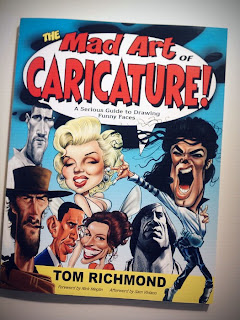
In my searching, I found three books to be extremely helpful that now go with me just about everywhere these days - they're that good.

This is fantastically more than just a simple how-to book on character design. It's largely geared towards characters for kids, but the underlying principles really span the entire board.


This is an even more in-depth look at pulling the personality of a character out through the features of a person. Still working through this one - it's chock-full of great insight.


This one is pretty straight-forward. It has an absolute TON of facial expressions from different people - young and old, guys and gals. A lot of diversity between the facial features.

All of these books are pretty cheap, so there's no excuse not to have them in your library if you're interested in character design at all!

Anybody have any other great recommendations to my ever-expanding illustration resource list?

Now to see if I can get some sort of commission for this little sales pitch... :)